Collection page
Collection pages are where customers browse and narrow down. The aim is simple: get them to the products quickly, and make filtering effortless.
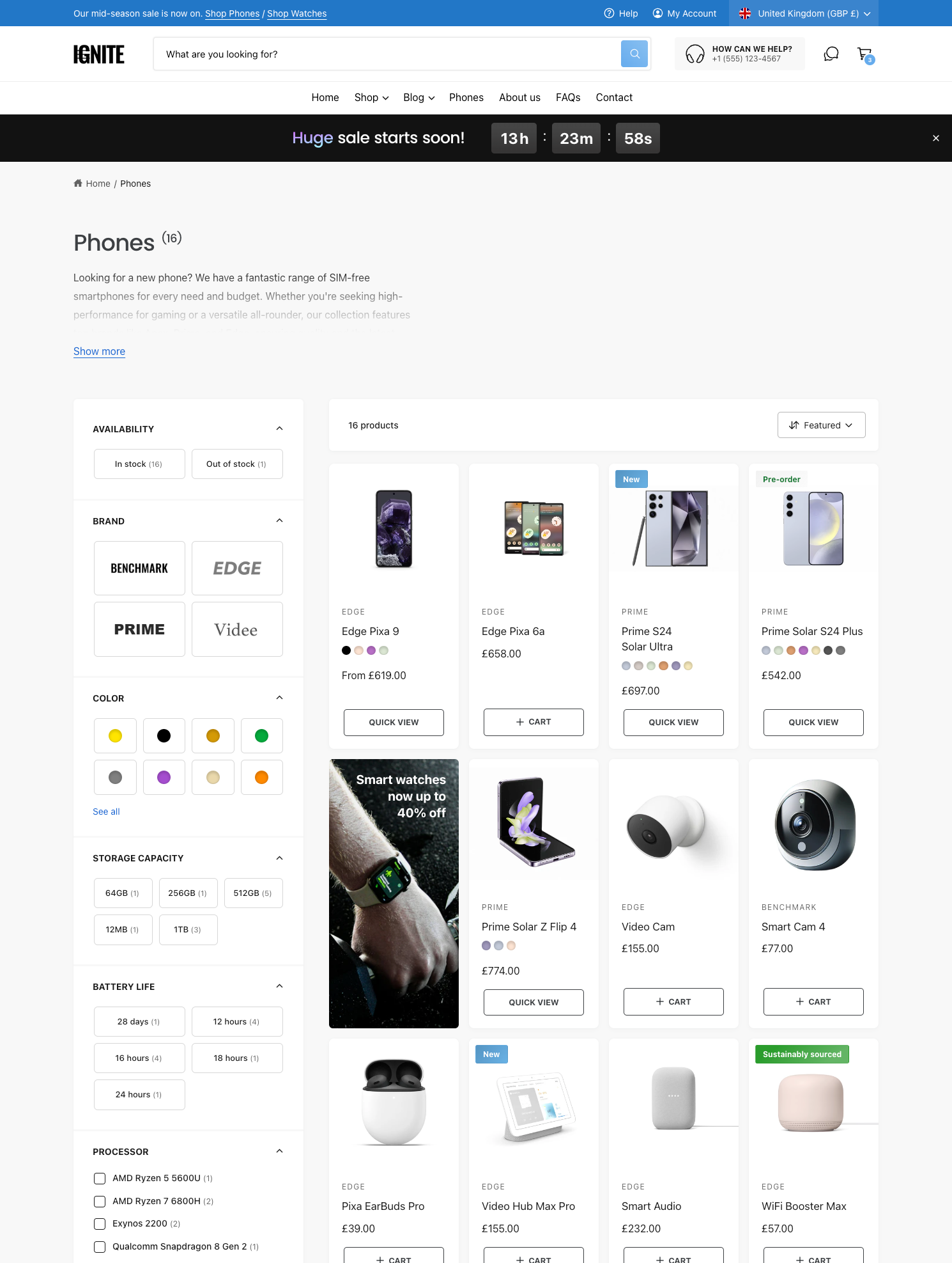
Open the collection template
In the theme editor, use the menu at the top to choose Collections > Default collection. The page has two main sections: the Collection banner at the top and the Product grid below.
Collection banner
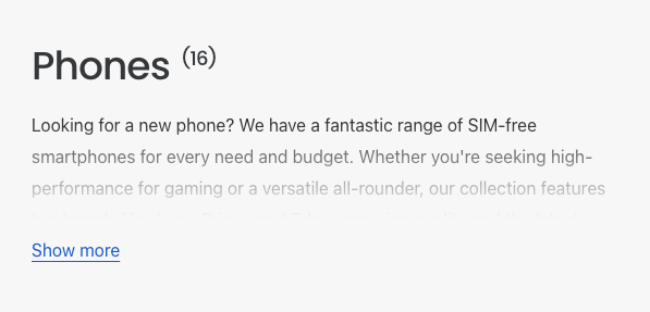
The banner shows the collection’s title and description, with an optional image. Keep it short, so customers see products without scrolling.
- Set Description maximum height in the Collection description block. Longer descriptions are cut off with a Show more link, and the full text stays readable for search engines.
- Add a Quick filter block to the banner to let customers narrow the collection straight away.
Filters
Filters come from the free Search & Discovery app in your Shopify admin. Add filters there, such as availability, brand, color and size, and they appear on your collection pages. See Shopify’s guide to setting up filters.
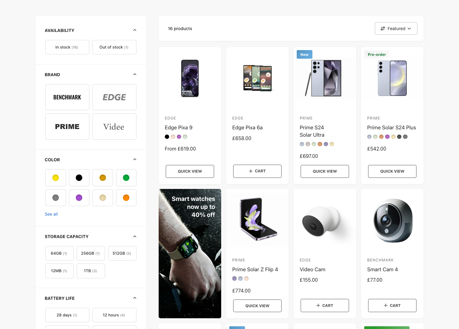
Ignite can show filters in four styles.
Filter boxes
Short options, such as sizes or storage capacities, look neater as a grid of boxes than a list of checkboxes. Type the filter names in Product options to box, one per line:
Size
Storage capacity
Battery life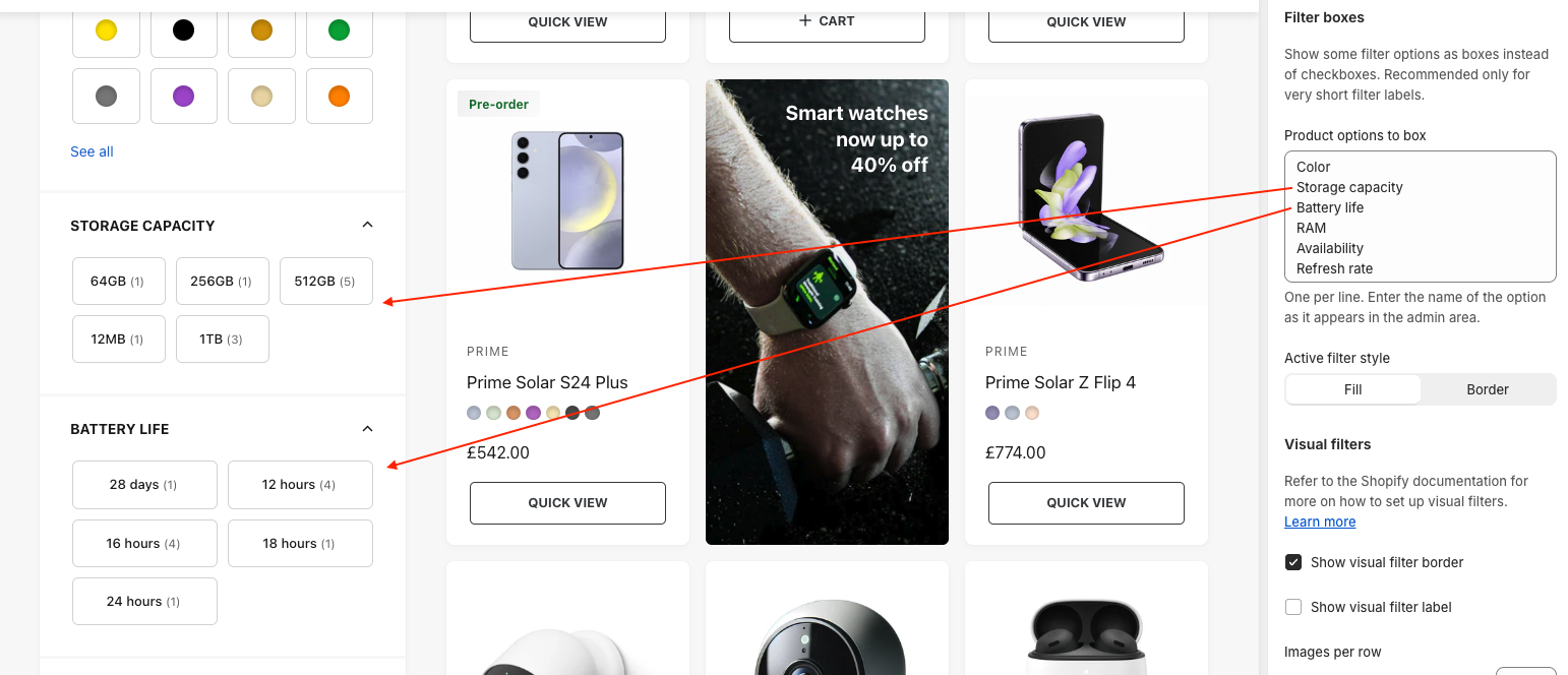
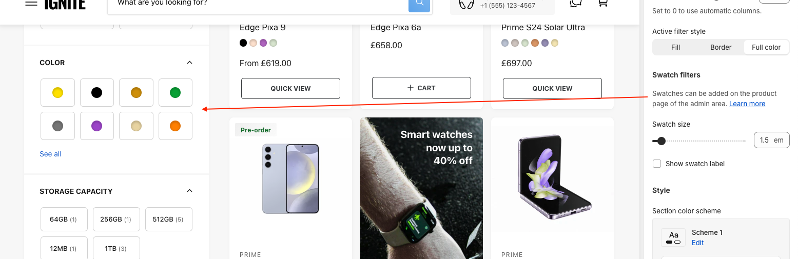
Swatch filters
Color filters can show as swatches. Swatches come from Shopify’s category metafields, which you set up on each product. See Shopify’s guide to swatches.
Visual filters
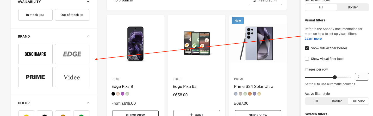
Visual filters use an image for each option, such as brand logos. Set them up in Search & Discovery, then adjust the layout with Images per row and the border and label settings.
Filter settings
| Setting | What it does |
|---|---|
| Filter layout on desktop | A side panel that’s always visible, or a drawer that opens from a button. Mobile always uses the drawer. |
| Show a maximum of X options per filter | Longer lists get a “Show more” link. |
| Open collapsible filters by default | Show filter options straight away, or keep them collapsed. |
| Show product count next to options | Shows how many products match each option. |
| Active filter style | How a chosen box or image is highlighted: a fill, a border or full color. |
Promotions in the grid
Promotions highlight another collection, a sale or a guide right where customers are browsing. There are two kinds, and you can use one of each.
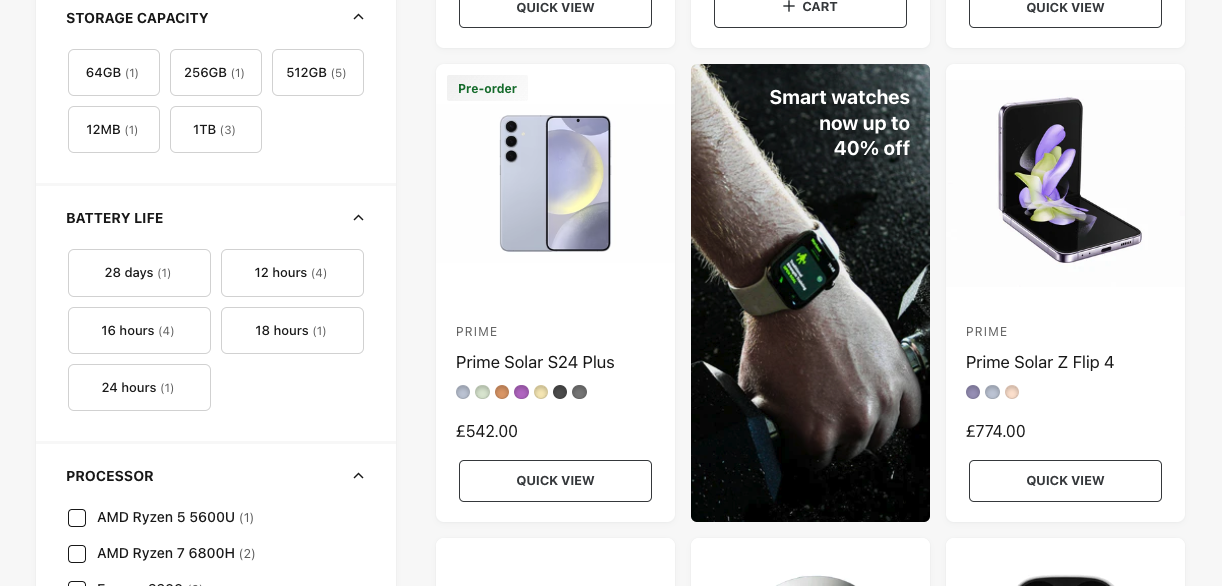
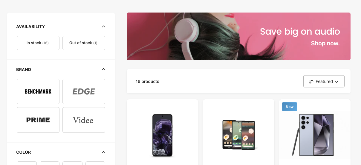
- Inline promotion: a tile among the products. Choose the position with Show before product at this position. It only shows on the first page of results.
- Top promotion: a wide banner above the products, for bigger campaigns.
Add them as blocks in the Product grid section. Each has an image, text and link, and can show on mobile, desktop or both.
Grid settings
| Setting | What it does |
|---|---|
| Products per page | 8 to 48. Fewer products load faster. |
| Card size on desktop | Small to extra large, which sets how many cards fit in a row. |
| Number of columns on mobile | One or two. |
| Enable sorting | Lets customers sort by price, best selling and more. |
| Full width | Runs the grid edge to edge. |
The cards themselves are set up in Product cards.