Product cards
The Product Cards settings in the Ignite theme allow for detailed customization of how products are displayed across your store. These settings are crucial for creating a visually appealing and cohesive shopping experience that can drive conversions and enhance user engagement.
- Navigate to the Theme Editor: From your Shopify admin dashboard, go to Online Store and click on Themes. Find the Ignite theme and click Customize.
- Navigate to Product Cards Settings: In the theme editor sidebar, click on Theme settings and click on Product cards.
- Adjust Card Style: Choose either ‘Standard or ‘Card’. The style selected here will feature throughout your store.
Standard:
Card:
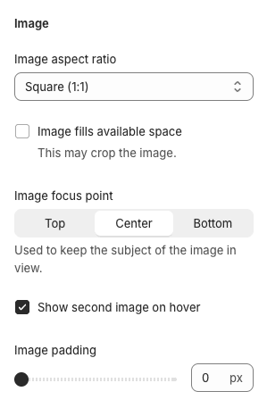
- Customize Image Settings: Configure the image aspect ratio and decide if images should fill the available space or not. This setting is important for maintaining the visual quality of your products across different display sizes.
- Set Text Alignment: Choose how the text on your product cards is aligned – either left, center or right alignment. This will affect the product name, price and other details on your store.
- Manage Display Options: Determine which elements to show on your product cards, such as vendor names or ratings. This customization helps you provide the necessary information at a glance to enhance shopping decisions.
- Apply Color and Typography Settings: Adjust the color schemes and fonts used on your product cards to ensure they align with your overall store design.
- Preview and Test: Always preview changes within the theme editor to ensure that the product cards look appealing and function well on both desktop and mobile devices.
- Save Changes: After making all necessary adjustments and ensuring that everything displays correctly, click Save to implement the changes across your store.
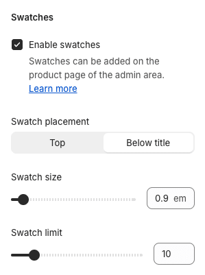
Swatches
Ignite uses Shopify swatches to display small colored indicators on product cards, as well as on the product page and product filters. For more on setting up swatches, refer to Shopify’s swatch documentation.
Use the settings to customize the look and feel of these swatches in the product cards. Note also, the corner rounding of the swatches can be changed in Theme Settings > Appearance.
Quick Add
Ignite has a powerful and highly customizable Quick Buy popup. The Product Card settings contain the setting necessary to show the Quick Add button.
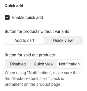
Note, the contents of the Quick View popup itself is set on the Product Page – by selecting which blocks are visible within Quick View.
Single variant products
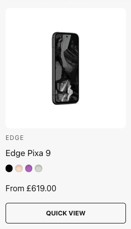
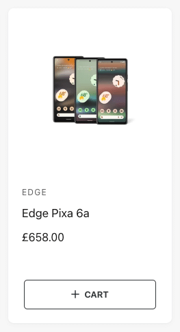
The ‘Button for products without variants’ setting will change the Quick Add button for products without variants, or single variant products. These products can be directly added to cart because no variant selection needs to be made, so set this to ‘Add to cart’ to get a card which looks like:
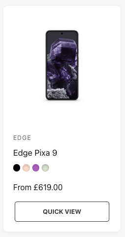
Or set to ‘Quick view’ to still require the Quick Add popup to be opened before adding to cart. In this case, the product card will look like this:

Sold out products
If a product is sold out, the button can also appear differently. Choose from the ‘Button for sold out products’ setting to alter the button seen for these products.
Disabled button:
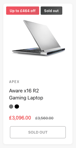
The button is disabled, and the Quick View cannot be opened.
Quick view:
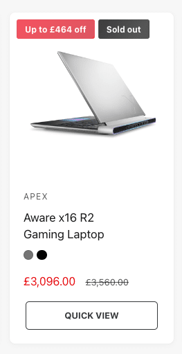
The Quick View can be opened.
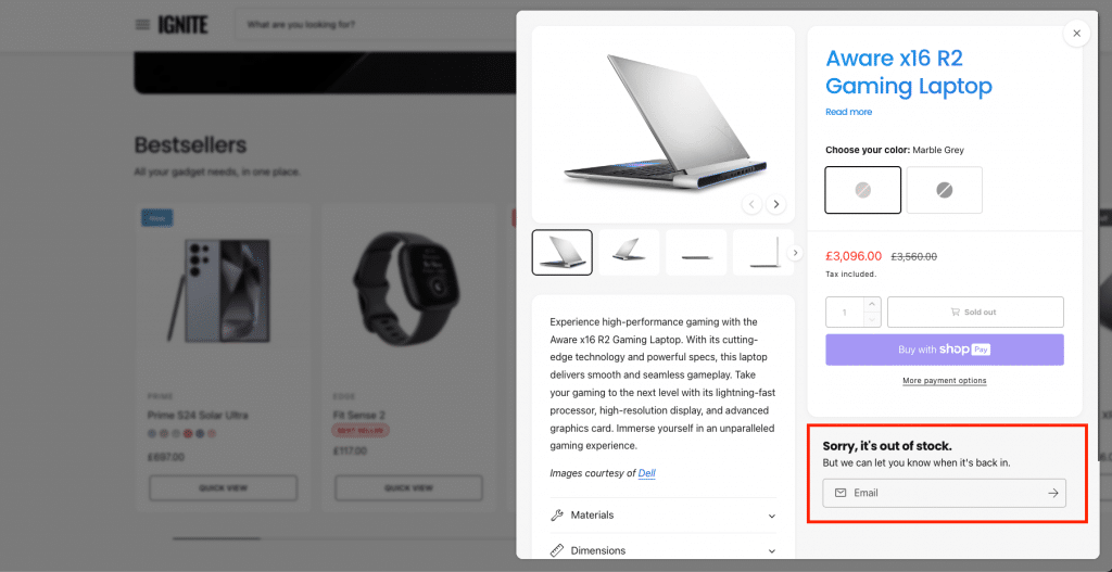
Notification:
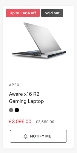
The Quick View can be opened, and it is assumed that the ‘Back in stock alert‘ block is prominently positioned within the popup, e.g.
Product badges
Product badges are a great way to draw attention to key product features like limited stock, promotions, or bestselling items. In the Ignite theme, badges appear on product cards throughout your store – such as on collection pages, featured product grids, and other product-based sections.

Types of Product Badges
Our themes offer several types of badges, all managed under Theme Settings > Product badges:
-
Sale badge: Automatically shows when a product is on sale (i.e. it has a compare-at price).
-
Sold out badge: Automatically shows when a product is out of stock and has no available variants.
-
New badge: Shows ‘New In’ text for products in designated ‘new’ collections (set by you).
- Preorder badge: Shows for preorder products.
- Bulk order badge: Shows for bulk order products. To show specific products as ‘Bulk order’, assign the ‘bulk-order’ template to those products.
-
Custom badge: A fully customizable badge that you control using product metafields. You choose the text that appears on a product-by-product basis (e.g. “Bestseller”, “Online exclusive”, or “Staff Pick”). More about this in the next section.
You can choose which of these to show, customize the badge style and colors, etc.
Setting Up a Custom Badge
The Custom badge allows you to manually apply unique badge text to individual products.

Here’s how to set it up:
A. Create the metafield
- In your Shopify admin, go to Settings > Metafields and metaobjects > Products.
- Click Add definition.
- Name it something like Custom badge.
- Set the Namespace and key to:
custom.badge
- For Content type, choose Single line text.
- Save the definition.
B. Add badge text to your products
- Go to Products in your Shopify admin.
- Open a product you want to add a custom badge to.
- Scroll down to the Metafields area.
- Enter your desired badge text into the “Custom badge” field (e.g. Top Rated).
- Save the product.
C. Enable/style the custom badge
- Go to Online Store > Themes, then click Customize for the theme.
- Open Theme Settings > Product badges.
- Scroll to the Custom badge section and turn it on.
- Customize the look and position of your badge as needed.
D. (Optional) Create metafields for custom badge colors per product
To give a product badge a unique color for that product, you can create additional Color metafields using the same method described in step A above:
- Background color
custom.badge_background_color
- Text (foreground) color
custom.badge_foreground_color
- Border color
custom.badge_border_color
Highlight badges
The Highlight badges feature displays small badges on product cards to spotlight unique product attributes – for example, “Wireless charging”, “Voice control”, or “Bestseller”.

To use this feature:
- Go to Shopify Admin > Settings > Metafields and metaobjects > Products.
- Create a List of values metafield with the content type Single line text.
- Set the Namespace and key to:
custom.highlights - Add one or more values to this metafield on any product you’d like to feature badges for.
Once set up, the metafield definition should look like this:
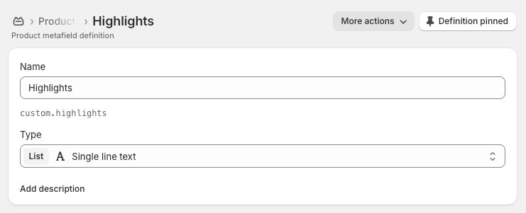
Each value will appear as a separate badge on the product card.
You can toggle this feature on or off or change how it looks in Theme Settings > Product cards > Highlight badges.
Also note: Product option badges, found just below Highlight badges in Theme Settings > Product cards, are a very similar feature. Instead of using metafields, these badges display the selected product options (e.g. “Matte Black”, “Small”) directly on the card.
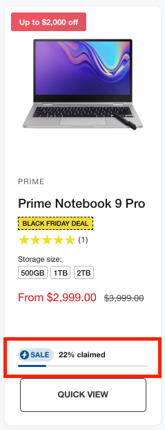
Flash sales
Version 2.3.0 of our theme introduces Flash sales – a new way to create urgency and boost conversions. Flash sales display a live progress bar on product cards, showing how much stock has been sold or claimed.
To use this feature:
- Create a collection, for example called ‘Flash sale’ and add the products you want to include.
- Open the Theme Editor, and navigate to Theme Settings > Flash sales.
- In the Collections setting, choose the collection you created in step 1. This tells the theme which products are part of your flash sale.
- Decide on a number for the Flash sale inventory threshold. This is explained in detail in the next section.
- The other settings in this section are cosmetic – feel free to experiment to match your store’s design.
Tip: If you have many products in your flash sale, setting Flash sale position to Bottom of card helps all progress bars align neatly.
The ‘Flash sale inventory threshold’
For the flash sale progress bar to work correctly, the theme needs to know what the total starting stock was for each product. Because Shopify does not provide this data automatically, you’ll need to define it yourself.
You can do this globally via Theme Settings > Flash sales by setting the Flash sale inventory threshold setting, and/or on a per-product basis using a metafield.
How it works:
- The Flash sale inventory threshold number represents the total stock that was originally available for flash sale products.
- When the current total inventory for that product drops below this threshold, and the product is part of your flash sale collection, the flash sale bar will appear.
- This number is the same for all flash sale products unless individual products have specific numbers set using metafields (see next section).
- The theme uses this number to calculate the percentage of stock claimed.
Example:
If the Flash sale inventory threshold is set to 10, and the product currently has a total of 5 units in stock (across all variants), the progress bar will display 50% claimed.
Setting custom thresholds per product (optional)
If you’d like to set a unique total stock number per product, you can create a product metafield:
- Go to Shopify Admin > Settings > Metafields and metaobjects > Products.
- Click Add definition.
- Set:
- Name: Flash sale threshold (or whatever you like)
- Namespace and key:
custom.flash_sale_threshold - Content type: Single line text
- Save the metafield.
- For each relevant product, enter a number (for example, 20) in this metafield to define that product’s total flash sale stock.
Once set up, the theme will automatically use this per-product metafield value instead of the global threshold when calculating progress. If a product does not have this set, the theme will default to use the value set in Theme Settings > Flash sales > Flash sale inventory threshold.
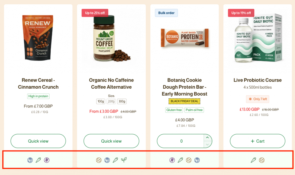
Product icons
We use metafields for product icons, which allow you to upload and display your own icons (like a vegan symbol) on both product cards and the product page.
To set this up:
A. Create a new product metafield:
- In your Shopify admin, go to Settings > Metafields and meta objects > Products.
- Click Add definition.
- Name it something like “Product icons”.
- Set the Namespace and key to:
custom.icons - For Content type, choose File.
- Select List of files.
- Restrict the field to only accept Images.
- At this point, the metafield should look like this:
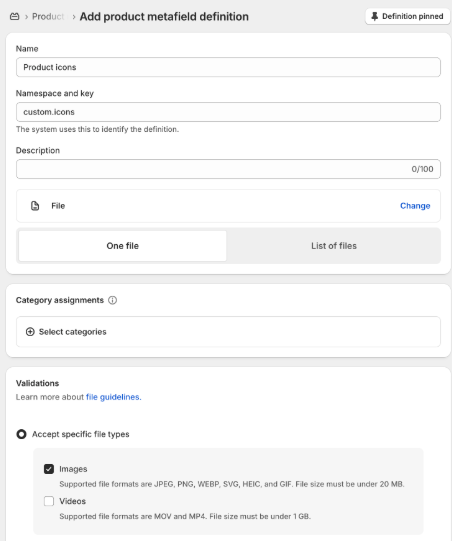
- Save the metafield definition.
B. Upload your custom icons
- Go to a product in your Shopify admin.
- Scroll down to the new Product icons metafield you just created.
- Upload your desired icon(s) here. We find the icon set on Google Material Design icons is good and allows you to download them as PNG files.
- Set alt text you set for each image. This is used as the tooltip (hover text) on product cards and also as the label on the product page in the Product icons block, so make it descriptive (e.g., “Vegan”).
C. Add the icons to product cards
- In the Theme Editor, go to a Collection page.
- Within Theme Settings > Product cards > Product icons – customize the settings to suit.
D. Add the icons to the product page (optional):
- In the Theme Editor, go to your Product template.
- Add the Product icons block inside the Product information section.
This will display your uploaded icons on both the product page and on product cards.