Multicolumn
A row of cards for features, benefits, categories or anything that works side by side. Mix three card types, and show them as a grid or a carousel.
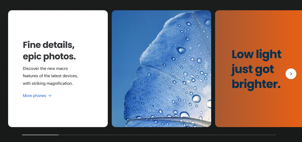
Choose your card types
Each card is a block, and there are three kinds. You can mix them in one section.
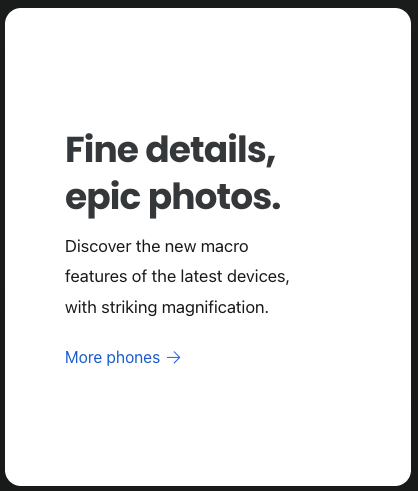
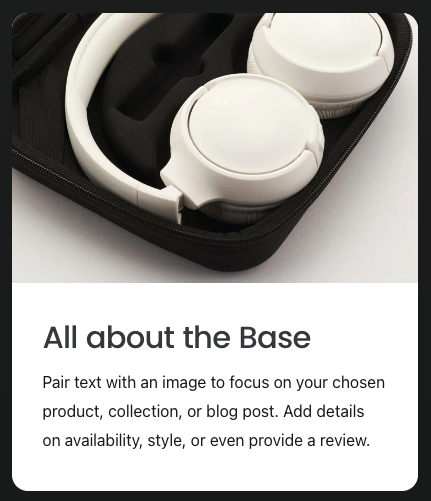

Every card type can have a heading, text, a button, an icon and its own color scheme.
Add a multicolumn section
- In the theme editor, click Add section and choose Multicolumn.
- Add a heading and description for the section, or leave them empty.
- Click Add block and choose a card type. Repeat for each card.
- Set the number of columns for desktop and mobile, and choose grid or carousel.
- Click Save.
Grid or carousel
- Desktop layout and Mobile layout: grid or carousel, set separately. A carousel on mobile keeps long rows of cards compact.
- Number of columns: 1 to 6 on desktop and 1 or 2 on mobile.
- Reduce the number of cards shown as the screen gets narrower: fits fewer cards on tablets and small laptops, so they don’t get squashed.
- Width on desktop: page width, standard or wide.
Icons
Cards can show an icon from Ignite’s built-in set, or one you upload. You can set the icon’s size, color and background shape (none, circle, rounded or square). Turn on Icons show at the bottom in the section settings to move icons under the text.
Card settings
| Setting | What it does |
|---|---|
| Content alignment | Aligns the text left, center or right, and to the top, middle or bottom of the card. |
| Content padding | The space inside the card. It scales down on smaller screens. |
| Image aspect ratio | The shape of the card’s image, including circle for standard cards. |
| Image position | Where the image sits in relation to the text. |
| Make heading as tall as possible | Lines up the text in neighboring cards when some headings are longer. |
| Heading | Supports ++ for a line break and rotating words. See animated headings. |
| Card color scheme | The card’s colors. Custom background overrides just the background. |
Section settings
| Setting | What it does |
|---|---|
| Minimum height | The shortest the cards can be on desktop and mobile. |
| Background image | An image behind the whole section. Use a big, wide image. |
| View more link | A link next to the heading, such as “See all features”. |
| Show card shadow | A soft shadow under each card. |
| Hide this section when there’s no card content to show | Useful when cards pull their content from metafields. |