Featured collection
Featured collection shows products from one collection, such as bestsellers, new arrivals or a sale, anywhere on a page. It’s the quickest way to put products on your home page.
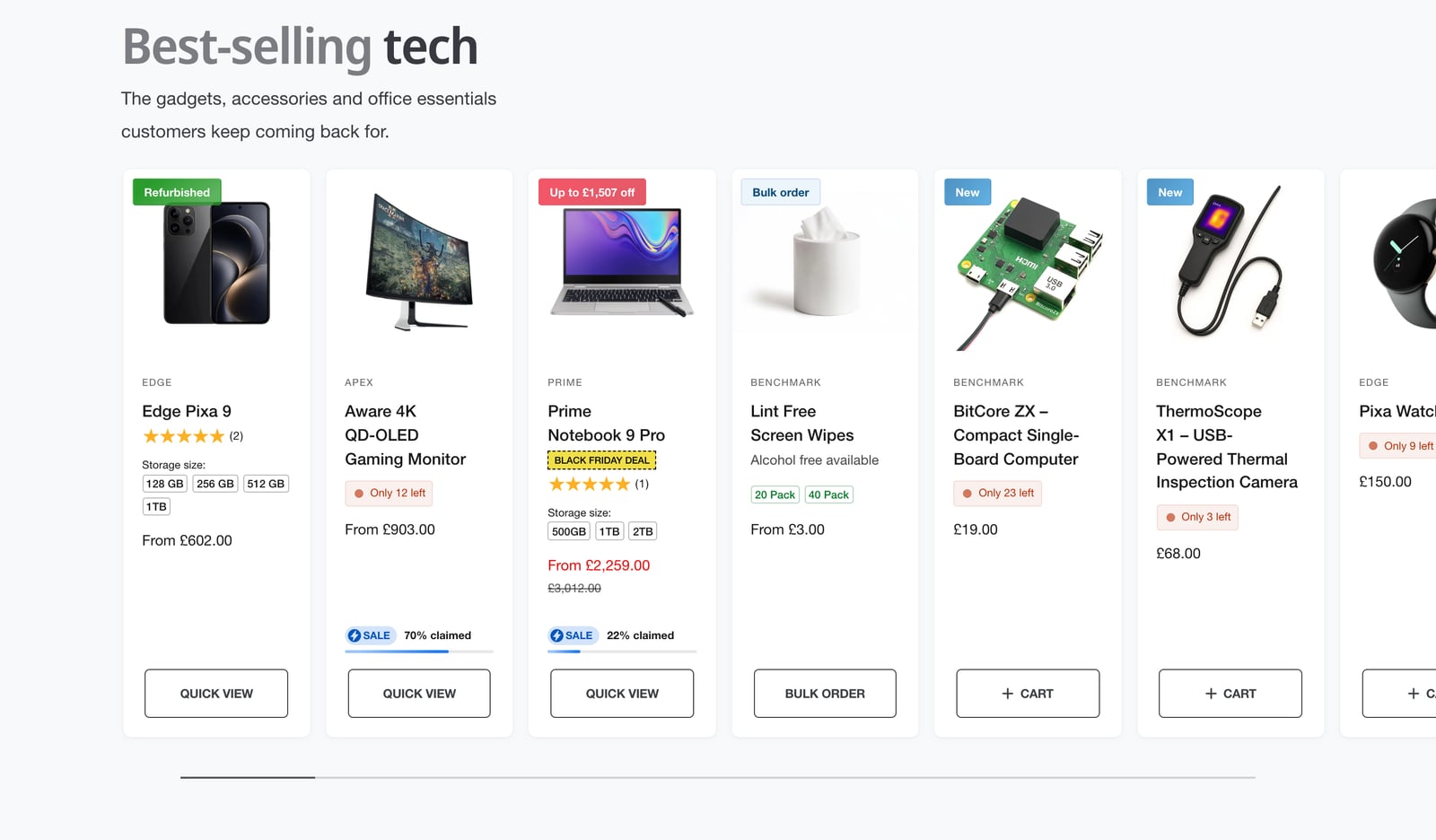
Add a featured collection
- In the theme editor, click Add section and choose Featured collection.
- Choose a Collection.
- Set Maximum products to show, from 2 to 24.
- Add a heading and description, or leave them empty.
- Click Save.
Products appear in the collection’s own sort order, which you set on the collection in your Shopify admin.
Grid or carousel
- Desktop layout and Mobile layout: grid or carousel, set separately. A carousel keeps a long row compact on a phone.
- Card size on desktop: XS to XL, which sets how many cards fit in a row.
- Number of columns on mobile: one or two.
- Width on desktop: page width, standard or wide.
The cards themselves, including badges, swatches and quick add, are set up in Product cards.
Lead customers to the full collection
- Show “View more” link: a link to the collection beside the heading.
- “View more” card: an extra card after the last product, such as “There’s plenty more”. Show it on mobile, desktop or both, with its own color scheme.
Both only appear when the collection has more products than the section shows.
Advanced
- Hide this section when there are no products to show: useful when the collection comes from a metafield that some pages leave empty.
- Only show at specific times of the day. See Showing sections at the right time.
To pick products one by one instead, use Product list.
Common questions
How do I show products from a collection on my Shopify home page with Ignite?
Add a Featured collection section, choose the collection, and set Maximum products to show, from 2 to 24.
Can the featured collection be a carousel on mobile and a grid on desktop?
Yes. Desktop layout and Mobile layout are set separately.
Why isn’t the View more link showing?
It only appears when the collection has more products than the section shows.