
Header/navigation
The header of your store is often the first point of interaction for your customers. It should be clear, well structured, intuitive and reflective of your brand’s style.

Here are the steps to customize the header in the Ignite theme:
Setting Up the Header Section
- Navigate to the Theme Editor: From your Shopify admin dashboard, go to Online Store and click on Themes. Find the Ignite theme and click Customize.
- Select the Header Section: In the theme editor, click on ‘Header’ to begin customizing your store’s header.
- Upload Your Logo: Upload a high-resolution version of your logo. Adjust the width and placement to suit your design preferences.
- Configure Navigation: Select your main menu. This needs to be previously created in the Shopify admin area, under ‘Content’ and then ‘Menus’.

Adjust the text size, spacing and style to ensure the navigation is user-friendly and accessible. You can use a mega menu to include multi-column drop-down menus if your catalog is extensive – see the instructions below for more explanation. - Enable Sticky Header: Toggle the option to make the header sticky. This will keep the header at the top of the screen as users scroll down, making navigation easy to access at all times.
- Customize Search Functionality: Enable or disable the predictive search feature. Consider incorporating an enhanced search bar to improve user experience.
- Add Contact and Social Links: Include necessary contact details and links to your social media platforms through the menu drawer and header to increase visibility and engagement.
- Preview and Test: Always preview your header on various devices to ensure it displays correctly and is functional across desktop and mobile platforms.
- Publish Your Changes: Once satisfied with the configuration, click ‘Save’, and then ‘Publish’ to update your live site.
Properly setting up your header will guide visitors seamlessly through their shopping experience, reflecting the professionalism and style of your brand.
Currency/language selector
The header section contains settings to enable with currency/language dropdowns on the burger menu only. This shows on mobile, and can show on desktop depending on the settings chosen. To show the currency/language pickers more overtly within the header on desktop, adjust the settings of the Announcement bar section.
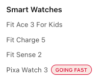
Adding link badges/stickers
Refer to the Stickers section guide to add stickers to menu links, e.g
Setting Up a Mega Menu
Creating a mega menu for your online store can enhance navigation and improve the overall shopping experience by presenting more options to your visitors in a structured and visually appealing way.
Below is a step-by-step guide on how to set up a mega menu within the header section of your Shopify store using Promo blocks.
- Access Your Theme Editor
- Log in to your Shopify admin dashboard.
- Go to ‘Online Store’ > ‘Themes’.
- Find your current theme and click ‘Customize’ to open the theme editor.
- Navigate to Header Settings: Once inside the theme editor, click on the ‘Header’ section to begin customizing the header where your mega menu will appear.
- Add Promo Blocks: Promo blocks are used to create complex drop-down menus that can display a wide range of content, including links, images and text.
- Within the Header settings, select ‘Add block’ and then select ‘Text promotions’ or ‘Image promotions’.
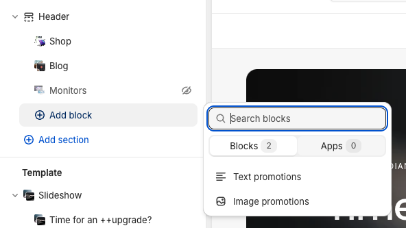
- Fill out the promo block with the content you want to display in your mega menu. This could include images, text descriptions, and links to various collections or products.
- Within the Header settings, select ‘Add block’ and then select ‘Text promotions’ or ‘Image promotions’.
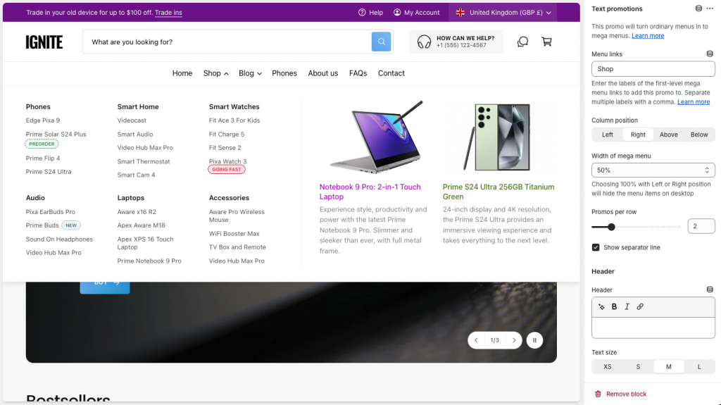
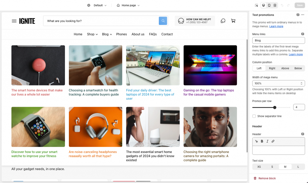
- Assign Promo Blocks to Header Links: To ensure that the promo blocks appear as part of your mega menu, you’ll need to link each promo block to a corresponding header link. Within the ‘Menu links’ setting, enter the text of the link to transform into a menu menu, as illustrated below.
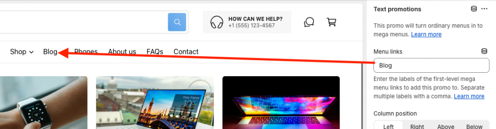
If your store is multi-lingual, you can enter the different translations for the link separated by commas. - Positioning: After assigning the blocks, use the three settings pictured below to position the promos within the mega menu. Experiment with a few different layouts. These settings can drastically alter the appearance of the promos.
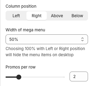
See example Promos/settings below. - Save and Publish: Once you are satisfied with the setup of your mega menu, click ‘Save’ to apply the changes. It’s essential to review your site’s functionality after publishing to ensure everything works as expected, particularly on mobile devices where navigation plays a crucial role in the user experience.
Example Promos
The screenshots below illustrate how we set up the promos on the Ignite Tech demo.
Compatibility Finder
NOTE: This feature is available from v2.7.0 onwards, so you may need to update your theme to access it.
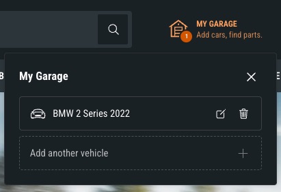
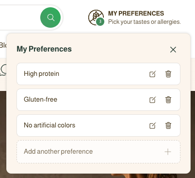
The Compatibility Finder lets a customer save what matters to them – the car they drive, the dietary preferences they follow, the device they own – and then see which products suit. Matching products are badged automatically on the product page and across your collections.
It sits behind an icon in the Header section, works without a customer account, and can store up to five saved items.
How it works
- The customer clicks the icon in your header and a small panel opens.
- They work through your dropdowns, optionally name their selection, and save it.
- The saved item expands to show the collections holding matching products, with counts if you enable them.
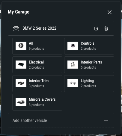
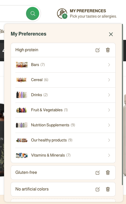
- Clicking a collection opens it with their filters already applied.
- As they browse your store, product cards which match one or more of their criteria are highlighted.
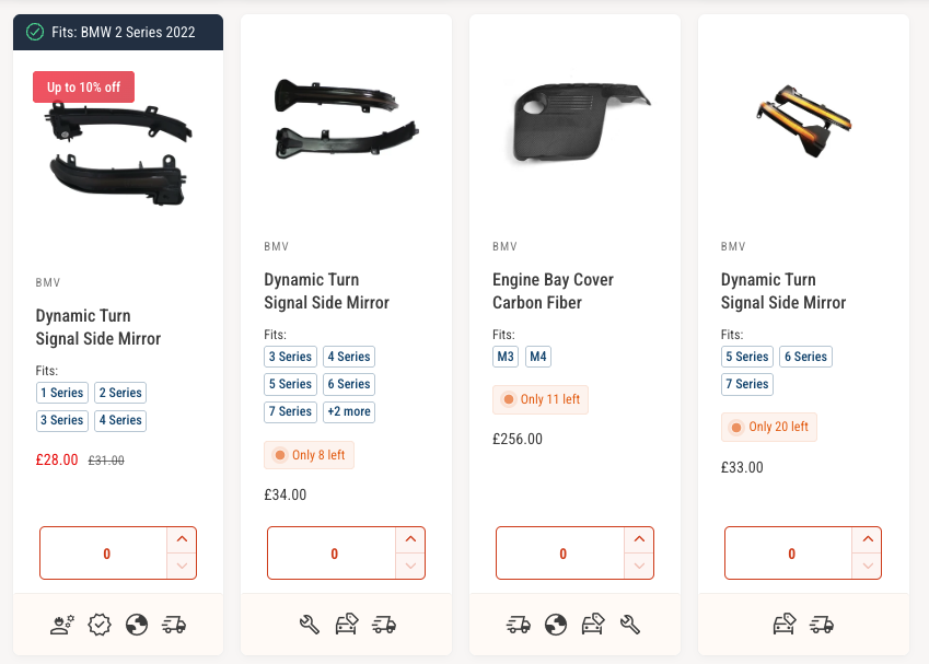
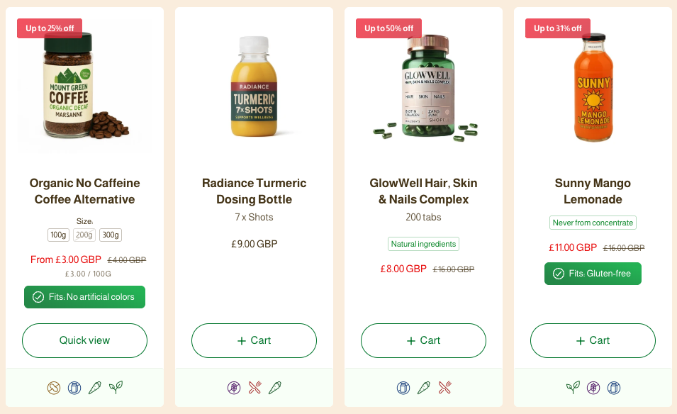
Saved items live in the customer’s own browser, so no login is needed – but the list is specific to that browser and is lost if they clear their browsing data or continue browsing on a different device.
This feature uses the same dropdown engine as the Quick filter (YMM) section and the same ‘Filter name’ values, so if you’re already using that section – proving your filters work there first means you can copy them straight across.
Setting Up the Compatibility Finder
- Set Up Your Filters First: The Compatibility Finder is powered by collection filters, which you create in Shopify’s free Search & Discovery app. Make sure they appear on your collection pages and return the products you’d expect.
- Turn On the Header Icon: Open the ‘Header’ section and find ‘Call to action & Compatibility finder’ settings. Enable it, then set ‘On click’ to ‘Open compatibility finder’. Choose an icon, ‘Heading’ and ‘Text’ etc.
- Add the Compatibility Finder block: Still in the Header section, select ‘Add block’ and then select ‘Compatibility finder’.
- Under each ‘Filter’ heading, enter a ‘Filter name’ matching the filter name on your collection page exactly, and a ‘Dropdown label’ for what the customer sees.
- Set ‘Use filters from this collection’ to a collection containing everything you want to be findable.
- Choose your ‘Collections to show’. Any collection with no matching products is hidden automatically.
- Enable ‘Show product count’ to tell customers where the matches actually are.
- Enable ‘Require every dropdown to be selected’ if a partial selection would give misleading results.
The remaining settings cover wording, text sizes, collection layout, colour schemes and corner radius.
- Badge the Product Page: Open your Product page template, select ‘Add block’ and then select ‘Compatibility badge’. The same block is available in the Featured product section.
Write [name] anywhere in the message to insert what the customer saved, as in the default ‘Fits your [name]’. If more than one saved item matches, all are listed. ‘When this product doesn’t match’ is set to ‘Hide’ by default — switch it to ‘Show a message’ to display a softer note instead.
Use ‘Preview’ while you design, as the badge depends on what an individual customer saved and would otherwise be invisible in the theme editor. It never affects your live storefront.
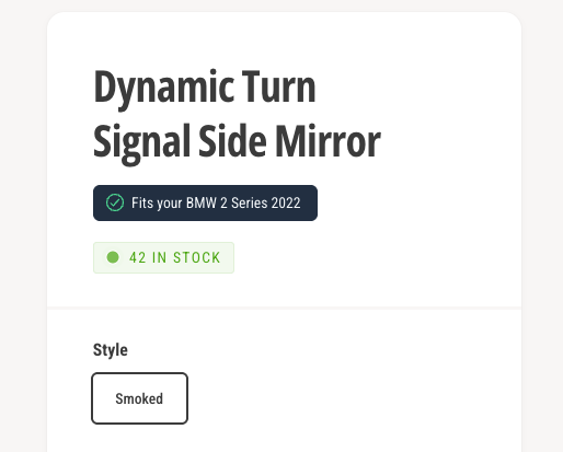
- Badge the Product Cards: Go to ‘Theme settings’ > ‘Product cards’ and find ‘Compatibility badge’. ‘Placement’ offers ‘Above title’, ‘Below price’, or ‘Top’ — a full-width bar across the top of the card, which gets its own ‘Alignment’ setting.
Card badges only ever show on a match, with no ‘uncertain’ state, which keeps collection grids clean. - Save and Publish: Once you are satisfied with the setup, click ‘Save’. Review the Finder on a mobile device as well as desktop, as the panel and header icon both adapt to smaller screens.
Which Filters Work
Badges work with filters built on product metafields (including Shopify’s own category metafields), variant options, product type and vendor. They do not currently work with tag-based filters — the Finder will still filter collections correctly, the badges just won’t appear.
Troubleshooting
A dropdown is empty or missing. The ‘Filter name’ doesn’t match the filter name on your collection page, or the filter isn’t set up in Search & Discovery.
A collection never appears. It holds no products matching that selection. This is deliberate — it stops customers reaching empty pages.
The badge isn’t showing. Check something has been saved in this browser, that the filter is one of the supported types above, and that the product’s value matches exactly.