Color schemes
The Colors settings in the Ignite theme provide the flexibility to tailor the color palette of your Shopify store to match your brand’s identity.
This feature utilizes Shopify’s color schemes, allowing you to maintain consistency and enhance the visual appeal of your store effectively. For more, refer to Shopify’s color scheme documentation.
- Navigate to the Theme Editor: From your Shopify admin dashboard, go to Online Store and click on Themes. Find the Ignite theme and click Customize.
- Open the Colors Setting: In the Theme editor, navigate to Theme settings and select Colors.
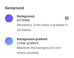
Here you will see the six predefined color schemes that come with your Ignite theme. In each color scheme, various color settings can be adjusted, such as background, text, links and buttons. By clicking on Add Scheme, further ones can be added. - Adjust Color Schemes: You can set different color schemes for various elements of your store. Adjust the background colors, text colors, button colors and link colors within each scheme. Each color setting may include the ability to set solid colors or utilize gradients, providing further customization.
- Preview Your Color Choices: As you make changes, use the theme’s preview feature to see how your choices affect the look of your store. This step is crucial to ensure that your color choices work well together and are comfortable for your visitors to view.
- Save Your Changes: Once you are satisfied with your color settings, click Save to apply them to your live site.
Colors play a critical role in user experience and brand perception. Choose colors that reflect your brand but also consider usability and accessibility. For instance, ensure there is good visual balance and sufficient contrast between text and background colors to ensure readability for all users.
Color scheme tips
Gradient fallbacks
Always provide a fall back for gradient colors. There are some situations where gradients wont show, so providing a Background color which complements the gradient is essential.

Take notes
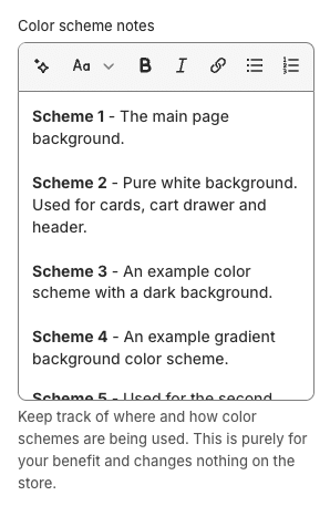
Keep track of where and how the color schemes are used. In our experience, color schemes can quickly become unmanageable. We recommend meticulously documenting where and how your color schemes are used in the ‘Color scheme notes’ setting. This setting does nothing, other than provide a way for you to record notes. No customer will ever see these notes.

Color scheme 1
Color scheme 1 is reserved. Color scheme 1 is used in many cases as the default color scheme and cannot be changed, e.g. for the page background of page templates, article pages, login pages, etc. You can still change this color scheme, but just be aware it’s use on several pages is not changable.
Layering
You can layer color schemes. In many places in Ignite, you can set a color scheme to be the same as the one underneath it. In this situation, normally the color scheme will be effectively disappear. For example, on the collection page if you don’t like the look of having a horizontal ‘panel’:
E.g.

The color scheme of the background can be chosen to effectively remove the color scheme:

More colors
There are more color settings. The ‘Theme Settings > Color schemes’ settings are just the color schemes. There are other colors which can be adjusted outside of this area, which appear in context – for example in ‘Theme Settings > Product cards’ contains colors which only affect the product card.
