Product page
The product page is a critical part of your Shopify store, where customers make the decision to purchase. It’s essential to configure this page carefully to provide all the necessary product information in a clear and appealing manner.
Setting Up the Product page
- Access the Theme Editor
- Log in to your Shopify admin dashboard.
- Go to ‘Online Store’ and then ‘Themes’.
- Find your active theme and click on ‘Customize’ to open the theme editor.
- Navigate to the Product Page: In the dropdown at the top of the theme editor, click on ‘Products’ and then ‘Default product’ to access the settings for this template. In the left hand side panel click on ‘Product information’ and this will bring up the options specific to product page configurations.
- Adjust the settings: Refer to the sections within this guide for more.
- Preview and Test: Use the theme editor’s preview feature to view your changes in real-time. Check the display on various devices and browsers to ensure compatibility and responsiveness.
- Save and Publish: Once you are satisfied with the setup, click ‘Save’ to apply the changes to your live site. Regularly revisit the product page settings to tweak and optimize based on customer feedback and performance analytics.
General layout
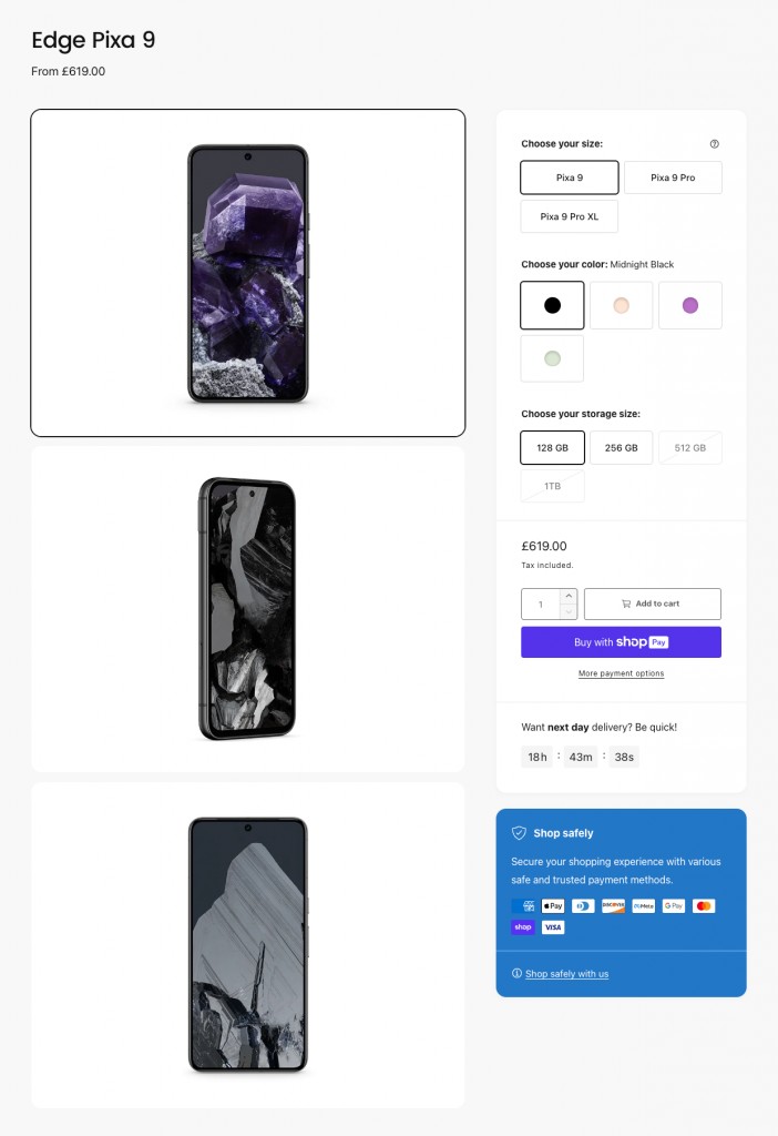
The product page has two main layouts.
Stack:
Slider:
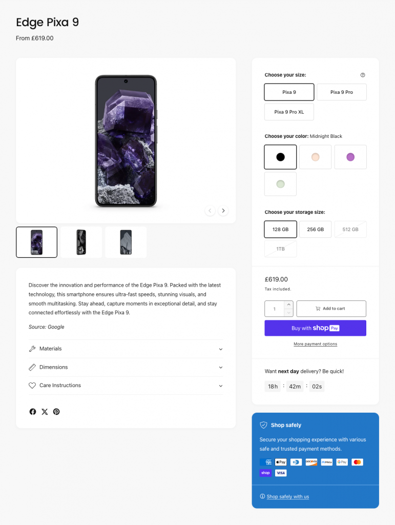
Consider using the Stack layout when product imagery is key to selling your product, otherwise the Slider layout is probably the best choice for most use cases.
Note: The Slider layout is always shown on mobile.
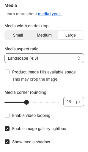
Each layout has it’s own settings to control various aspects of it’s appearance, and the Media settings apply to both layouts:
Product title
The product title can be shown above the product media, on either mobile, desktop, or both.
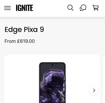

This can be controlled via the ‘Page title’ settings within the ‘Product information’ section:
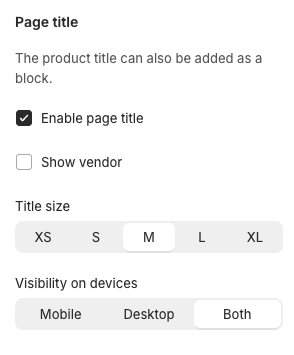
Alternatively, the product title can be shown within the right hand side product information on mobile, desktop, or both by adding the Title product block to the page:
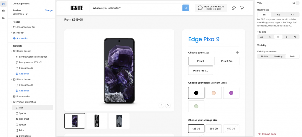
You can use various combinations of these settings to effectively show the product title in different locations depending on the device.
Panels
Panels are powerful ways of arranging content within the page. Adding a Panel block to the ‘Product information’ section will cause all blocks below to sit inside that Panel, until a new Panel is found, as illustrated below.
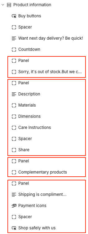
Each red box in the above indicates a Panel. In this example, the second Panel outlined above looks like this:
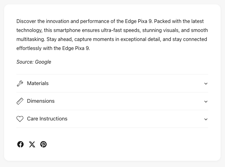
Once a Panel has been defined, it’s contents can be moved or selectively shown, e.g. by device, within Quick Buy, and/or moved below the product media:
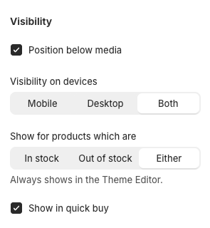
It may be complex to begin with, but once you’ve created a few Panels, we hope you find them flexible and powerful.
Alert section
Although not directly related to the product page, the Alert section can be used to create a sense of urgency by showing messages on the product page (see bottom left corner below).
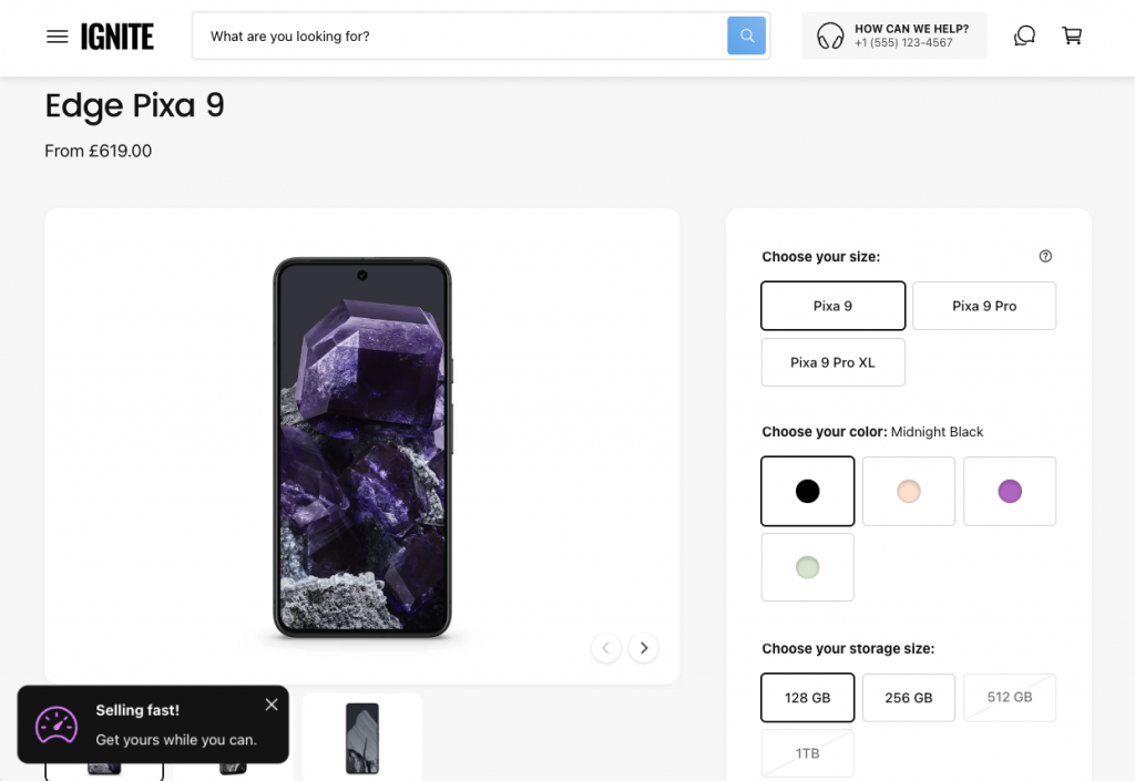
Refer to the section settings to see the range of flexible settings that are available, including when and how this alert shows.
Note, metafields could be used to display a custom message per product.
To hide this alert for products which do not contain a message (i.e. because the metafield is empty for that product), enable this setting within the alert section:
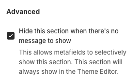
Blocks
Ignite ships with the standard blocks you’d expect with a premium theme, plus a host of powerful and unique blocks. Below are a few of our favorite ones (aside from Panels, see above).
Back in stock alert
This block allows your customers to request to be notified when the product comes back in stock, without the need for an app.
Note, if you’re using a theme version prior to 2.4.0, the entire product (all variants) must be out of stock for this block to show. From v2.4.0 onwards, this block has an option to show if the selected variant is out of stock.
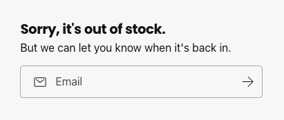
It’s important to note, you will receive an email notifying you of their request – and it’s then up to you to make a note of this and email customers when a product becomes available. The theme will not do this.
Spacer
The Spacer block is surprisingly useful. It allows you to insert additional space between blocks where needed, as well as create dividers within panels, either full width or not. They can show on mobile, desktop or both. Additionally, they can be set to show or not show within Quick Buy.


Pop-up button
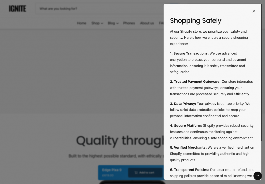
This block allows you to add a link or button which can open a modal.
For example the ‘Shop safely with us’ link at the bottom of this panel:
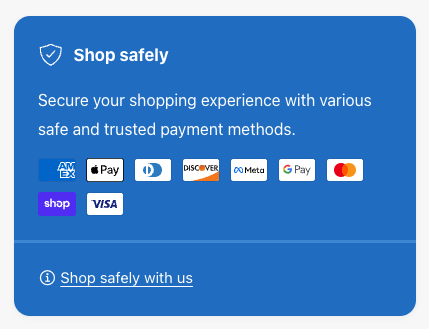
opens this modal:
Download button
The download button can be a useful way to surface downloadable content to accompany the product, such as user manuals or warranty information.
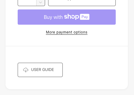
It’s important to note, that due to Shopify server restrictions, only zip files will start a download. All other files (such as PDFs) will open in a new tab. There is no way around this at present.
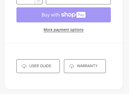
Buttons can be positioned next to one another (if they fit!) by using the ‘Show next to adjacent download buttons when possible’ setting:
Trust badges
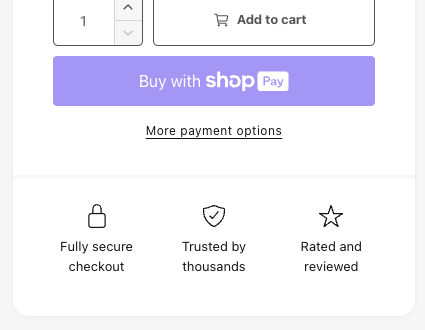
Consider placing trust badges near the Add to Cart buttons for added peace and security for customers wishing to purchase.
Notification message
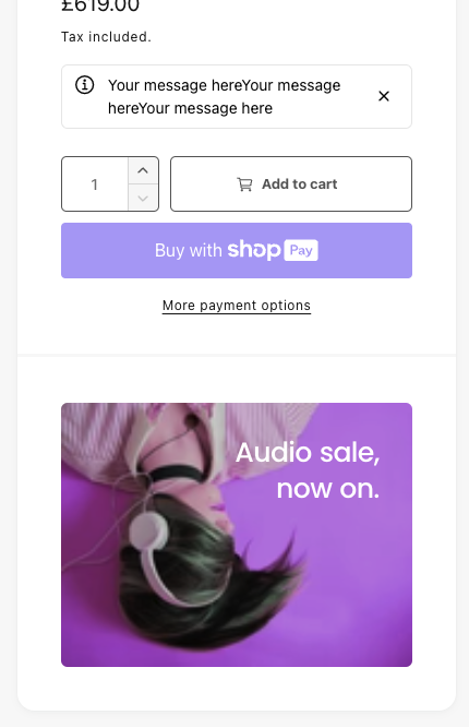
This can be useful for conveying important information before purchasing. Once closed, the notification will not show for any product using the same product template. The close button is optional however, so if this is undesired, the close button can be turned off.

Promo
The promo block can be used for cross selling, or perhaps just additional product information.
Custom field
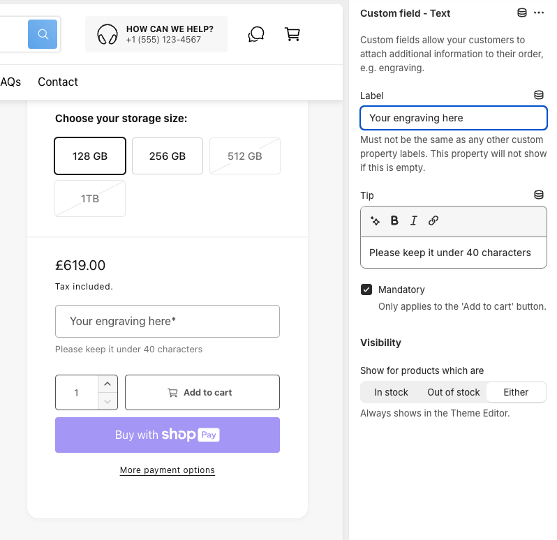
The Custom field blocks allow customers to submit custom properties with their product order. This can be useful for example for engraving jewellery or specifying custom requests with their product.
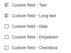
Note, there are 5 different custom field blocks which can be used alongside one another:
Table
The Table block allows you to create tables of information for your product. The tables are restricted to two columns and up to 15 rows which could display data such as nutritional information about food, technical specifications for an electronic device or compatibility data for car parts. This section focussed on the latter example.
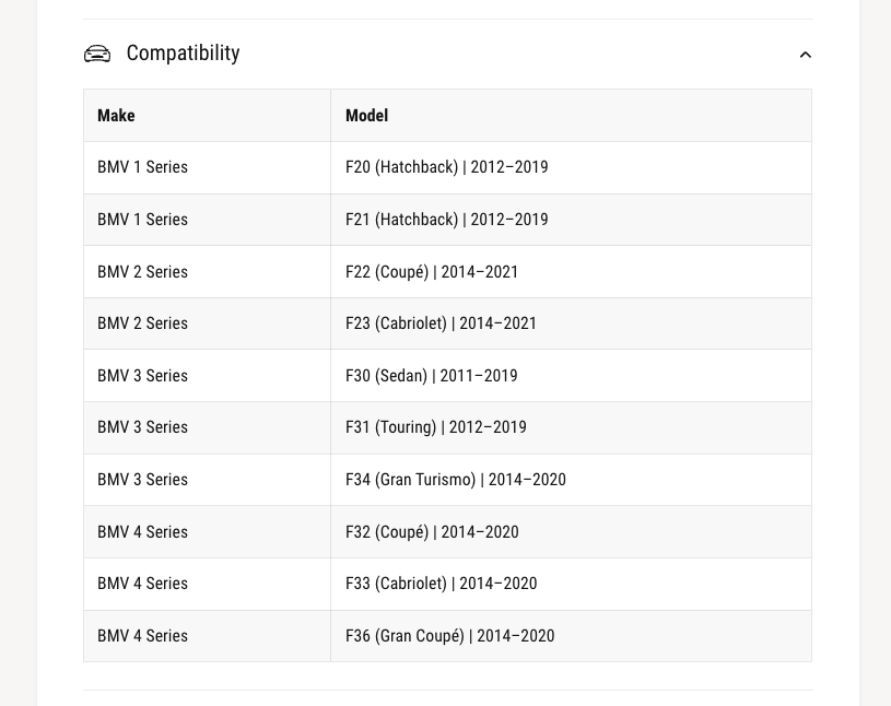
Each product on the Alpha preset (Car parts) features a compatibility table like this:
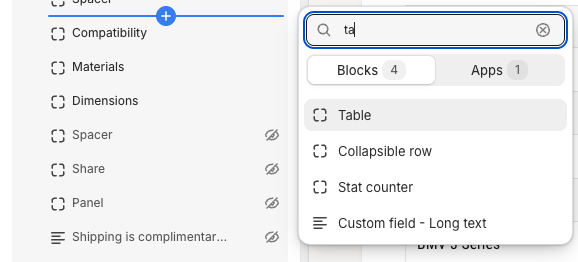
To create this, add the Table block to the Product Information section:
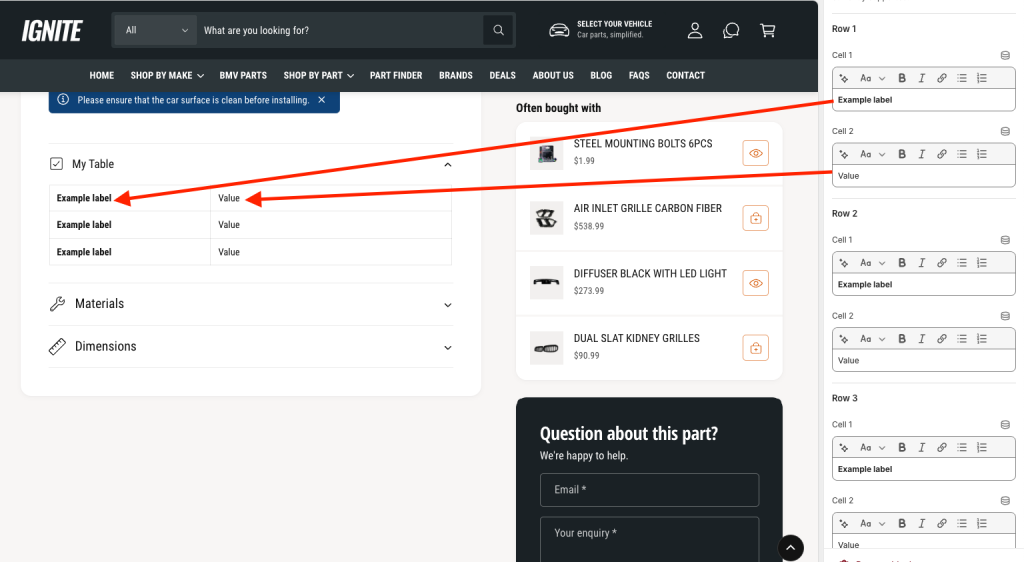
This gives you a table containing example data, where each Row setting in the Theme Editor corresponds to a row within the table, e.g.
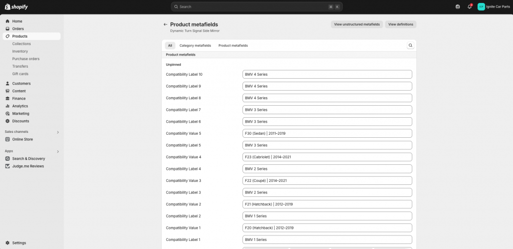
When building our Alpha (car parts) preset, we created a Product metafield for each cell of the table, resulting in 30 metafields (i.e. two cells per row at 15 rows) in which we would store our car compatibility data. We then filled in the data for each metafield for each product on the store, e.g.
We then assigned each metafield to the corresponding row/cell within the theme:
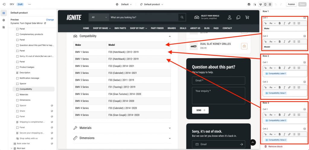
Note: Empty rows will not show – so if your product only has two rows of data, only two rows will show.
This may seem quite painstaking, and it is. It took us a long time to do. As far as we know there’s no quicker or easier way to do this in a theme (without using an app at least).
