How to add product comparison to your Shopify store
Shoppers comparing two similar products will open a second tab if your store doesn’t help. Here’s how to put the comparison on your store instead, step by step.
Quick answer
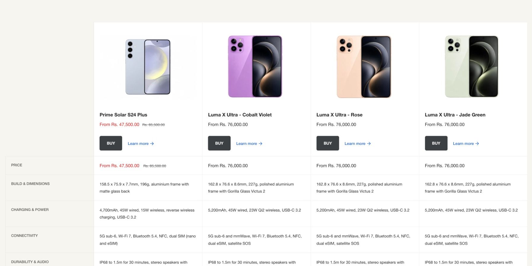
To add product comparison to Shopify without an app, use a theme that has it built in, such as Ignite. Store each specification in a product metafield. Then add a Product compare section for a comparison you build, such as “Which model is right for you?”, and turn on the Product compare drawer so shoppers can tick products as they browse and see them side by side.
We make Ignite, so the step-by-step part of this guide uses it. The planning advice works whichever theme or app you use.
Why comparison matters
When two products look alike, shoppers don’t buy. They open a second tab, then a third, then a review site, and the store that started the research rarely finishes it. A good comparison keeps the decision on your store: the two options, the three specs that separate them and the price, side by side.
It matters most where products differ in the details: phones and laptops, power tools, appliances, bike parts, mattresses, supplements by dose. If your shoppers ever ask “what’s the difference between these two?”, you need one.
Three ways to add comparison on Shopify
- An app. Works with any theme, but it’s usually another subscription and another script on every page, and it won’t always look like the rest of your store.
- Custom code. A developer builds a comparison section for your theme. It fits perfectly, but you pay for it, and you maintain it when the theme updates.
- A theme with it built in. No extra cost and no extra script, and it’s updated with the theme. Ignite has it, and so does Hyper, according to its Theme Store listing. Check any theme’s demo store before you buy.
Two kinds of comparison
Decide first who chooses the products, because it changes what you build.
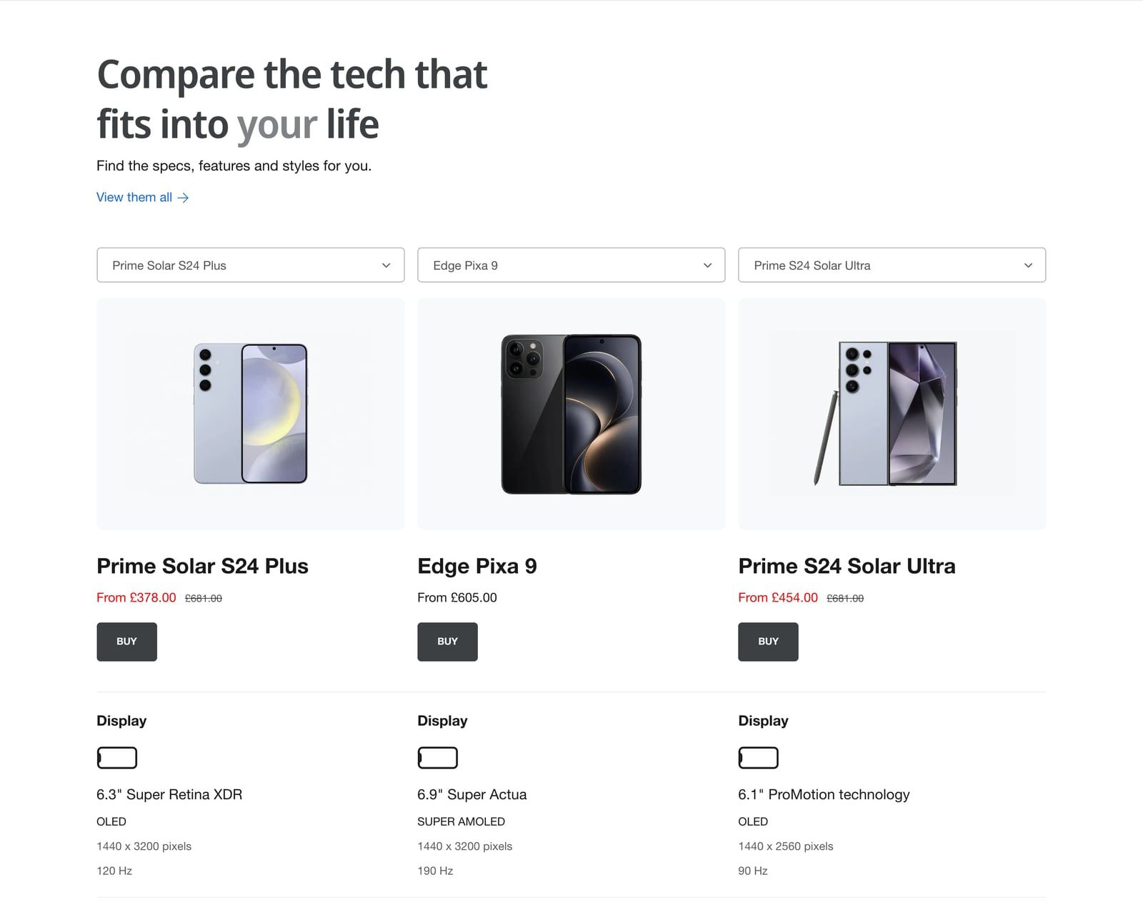
- A comparison you build. You pick the products and the rows, such as “Which phone is right for you?” on a landing page. Best for a small range, or your most popular models.
- A comparison shoppers build. They tick products on a collection page as they browse, then compare whatever they chose. Best for a big catalog, where you can’t guess which two they’re torn between.
Most stores with a lot to compare want both.
Step 1: Put your specs in metafields
A comparison is only as good as its data. Specs pasted into product descriptions can’t line up in a table, so give each one its own field.
- In your Shopify admin, go to Settings > Custom data > Products.
- Add a definition for each spec you’ll compare, such as screen size, battery life or weight. Use Integer for a score out of 5, and True or false for a yes/no feature such as “Waterproof”.
- Fill the metafields in on each product. For a big catalog, Shopify’s bulk editor saves a lot of clicks.
Keep the list short. Five to eight rows that actually separate your products beat thirty that don’t. Lead with the spec that decides most purchases, then the price.
Step 2: Build a comparison table
- In the theme editor, click Add section and choose Product compare.
- In Products to compare, choose up to 10 products.
- Add a block for each row. Product summary shows the image, price and quick add button. Product metafield shows a spec: type its namespace and key, such as
custom.screen_size, and add a prefix or suffix such as “hours”. - For scores and features, use Product score metafield (icons, such as 4 out of 5 stars) and Product yes/no metafield (a check or a cross).
- Choose a Layout on desktop: Labels in each card, or Labels in a left column like a classic table.
- Click Save.
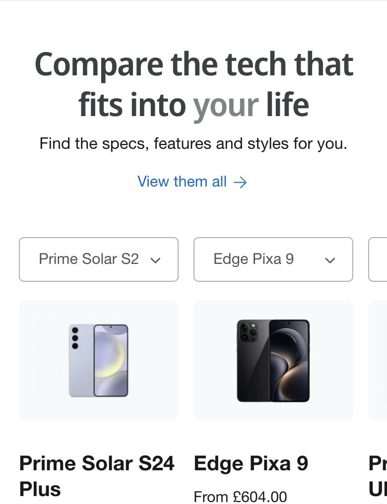
Two extras are worth turning on. A Product switcher block adds a dropdown above each product, so shoppers can swap in another model from a list you choose. And Pin product summary when scrolling keeps the names and prices in view through a long comparison.
Step 3: Let shoppers compare as they browse
- In the theme editor, find the Product compare drawer section in the Overlays group of the sidebar. If it isn’t there, click Add section in Overlays to add it.
- Set Maximum products to compare, from 2 to 10.
- Choose where it works with Show drawer on: collection and search pages, chosen collections only, or all pages.
- Add the same row blocks as your comparison table, then click Save.
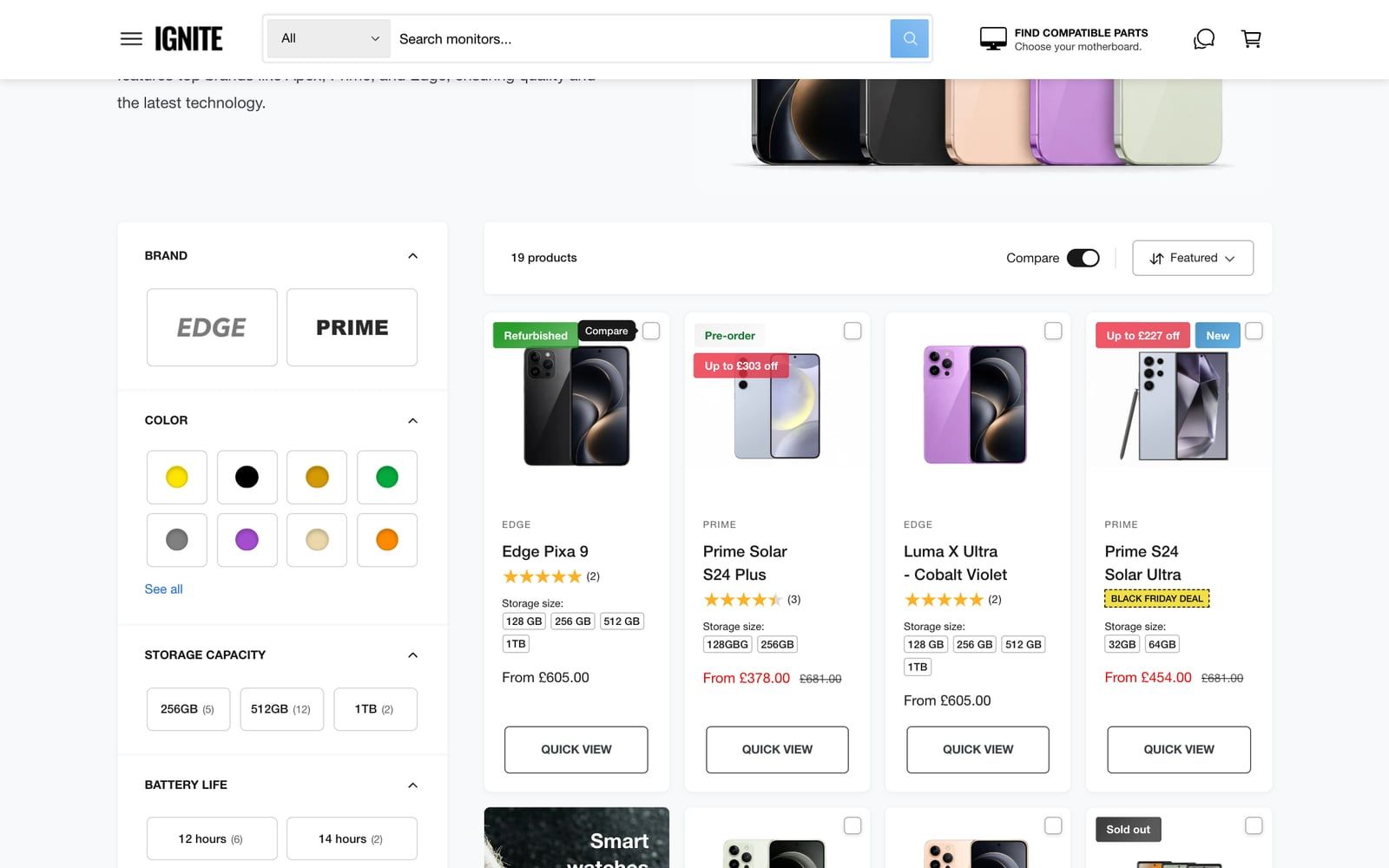
Shoppers now see a Compare checkbox on product cards. What they tick collects in a drawer, and one click shows them side by side. The list is saved in their browser, so it survives a coffee break.
If you sell very different products, turn on Separate comparison for each collection. A comparison only makes sense between things that share the same specs, and nobody needs a phone compared with a charger.
Step 4: Help search engines and AI assistants read it
A comparison laid out in cards looks great to people, but machines read plain tables more easily. Ignite also writes each comparison as a simple table hidden in the page, which search engines and AI assistants can read.
Fill in Comparison table AI text in the section settings with a one-line summary, such as “The Pixa 9 has the brightest screen; the S24 Ultra has the longest battery life.” Shoppers don’t see it, but when someone asks an AI assistant which model to buy, that’s the sentence you want it to find.
Tips for comparisons that sell
- Compare like with like. Two to four products in the same price band are easier to choose between than a table of ten.
- Fill every cell. An empty cell looks like a missing feature. Set Text for empty values to something honest, such as “Not available”.
- Put the buy button in the table. The Product summary block includes quick add, so the decision and the purchase happen in the same place.
- Link to it. A “Which one is right for me?” link on the product page sends undecided shoppers to the comparison rather than away.
The Product compare guide and compare drawer guide list every setting. To see how comparison fits into a whole tech store, see the best Shopify theme for electronics, or read the 5 best Shopify themes for electronics stores.
Questions
Can I add product comparison to Shopify without an app?
Yes, with a theme that has it built in. In Ignite, the Product compare section builds a comparison table on any page, and the Product compare drawer lets shoppers tick products on collection pages and compare them side by side. Neither needs an app. Set up Product compare.
How many products can shoppers compare at once?
In Ignite, a Product compare section shows up to 10 products. The compare drawer takes between 2 and 10, which you set with Maximum products to compare.
Where do the specifications in a comparison come from?
From product metafields. Create one metafield per specification in Settings > Custom data > Products, fill it in on each product, then add a Product metafield block for it in the comparison.
Can I show a star score or a yes/no tick in a comparison?
Yes. A Product score metafield block shows a whole number as icons, such as 4 out of 5 stars, from an Integer metafield. A Product yes/no metafield block shows a check or a cross from a True or false metafield.
Do shoppers lose their comparison when they leave the page?
No. Ignite saves the compare list in the shopper’s browser, so it’s still there as they move between pages or come back later on the same device. Set up the compare drawer.
Can AI assistants read a product comparison?
They read plain text and tables most easily. Ignite also writes each comparison as a simple table hidden in the page, and you can add a short summary to it with Comparison table AI text, such as which model has the longest battery life.
This page contains affiliate links to the Shopify Theme Store. If you buy a theme through one, we may earn a commission, whichever theme you choose.